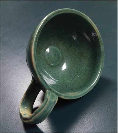
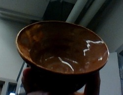
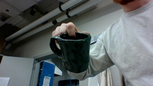
By far one of my most well made bowls the center of mass is perfect, now that footing isn't as good as some of my other projects. But the glazing is again a blue green that has spotted areas that i did on purpose to give it a bit of a rustic look. I feel like the center circle is something that I'm going to start doing to give a nice personal point in my creations and to tell pick it out of other creations. the form is very round evenly going form the base up. Something that i struggled with was the handle because i was under time restraint i tried to complete it as fast as i could.
0 Comments
The lidded project has a very stark contrast between the blue green and the white inside. the form of the base flows from the base outwards and slightly back inwards before it's over. The form of the lid is very simplistic and fits perfectly on the top snugly. The struggles that i went through with making this project was comparing the sizes of the lid and base and grabbing the correct amount of clay. This planter was a failed attempt to make a very mixed glazing, but came out very spotty like with a combo of white blue and dark green. The height of the planter stands at a short 5 inches and can hold a pint of water. the form is very bad and i failed to open the center bowl enough. The contrast between the colors is terrible. and needs large amounts of work. In the future i plan on spending a little long glazing and throwing a planter. This Franken pot was pretty straight forward, there wasn't too many issues with the throwing of the pots or the connecting of the pots. All my group members Jamie and Ryann worked diligently and effectively to complete this vase. There were some mess ups by Ryann when she was throwing the pot but everything else went rather smoothly and not many issues arose even during the connecting of the pots and we got to the connecting really fast and at the right hardness to slip them together. Then all three of us decided on colors and design choices with the face on the front. With a nice tan glazing and a green inner color. The darker green and tan really contrast to make this a very nice looking vase.
The bowl seeping darkness has a very dark green under tone with a brimmed grayish green tip that seeps down into the center of the bowl and the edges of the bowl. The struggles that arose was trying to keep the top very level with the rest of the top. But this was otherwise a very slick bowl to make and is extremely fluid and smooth all around with a very prime footing job. This is also very equal all the way from the base to the brim with a nice lip on the foot.
Orange Dawn is the evolution of bowl technology, this is how the people should of been eating their cereal for centuries. The glazed parts as you go up, slowly lighten and part form the deep orange of the base to the top. The contrast between the top and the bottom give life to this other wise dead bowl. The struggles that i went through to construct this magical bowl were trying to thin the brim of the and pull it out.
As the night encumbers this plate the brighter colors are all enveloped with the darkness of night. As you can tell the dark streaks going the center of the plate connecting to almost every orange or blue or green around the plate. I didn't mean this dark streak to happen but the splatter with the color just kind of came out of no where and i went with it. The contrast between the two colors of the light tan and the darker glaze. Even though this is a small plate roughly 8 inches in diameter. But very symmetrical all the way around the plate.
This splattered rice bowl is a sprinkle of every kind of rice amidst the world. As the colors combined and made newer colors from past colors splattered over it. This gives a really complex look form the green and orange clashing with the tan. At only roughly 3 inches tall and a very well endowed base this symmetric simple bowl is given life with the awesome glazing.
The old timey barn from times gone by turned into artistes dream work adorning the barn. After many years of decay the barn has started to list and lean, giving it a rustic style. The brownish exterior and yellow stars create a wonderful contrast between the two colors. It stands about 8 inches off the ground , and i learned how to use hard slab to create geometric shapes.
The Withering paint on the mug may of been an error on my part. Has lead to a unique design that resembles the decaying of paint on a house from new to old. The contrast between the two greens shows the decay of green then the patching that may seem like an error has turned into a characteristic that symbolizes it. The idea that i took from this was not to use too much glaze, because it causes the parting of glaze. |
AuthorWrite something about yourself. No need to be fancy, just an overview. Archives
June 2016
Categories |